The spacing between the letters of text is called
Kerning. With some fonts, the spacing between the letters is uneven, so you may want to adjust it.
As you can see in this Before image, the spacing between the T and A is greater than the spacing between the other letters.
Before 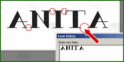
To adjust the kerning between two letters (like the T and A), select only the letter T in the Text Entry dialog box (see After image below). Then on the Text Toolbar, uncheck

the Auto Kern box and enter a value for the Kerning. For this font with the font size that I'm using, I've entered a value of "-200" to bring the two letters together (negative values decrease the space between letters while positive values increase the space).
After 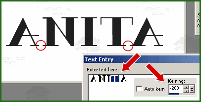
You can repeat the selecting and Kerning adjustment for any of the letters until you are satisfied with the spacing. The kerning adjustment occurs to the right of the letter that is selected.
Click Apply to close the Text Entry box.
 Post Codes
 PSP Challenges
 Smileys