|
|
| من: justjam (الرسالة الأصلية) |
مبعوث: 27/02/2018 00:43 |
Magically Delicious

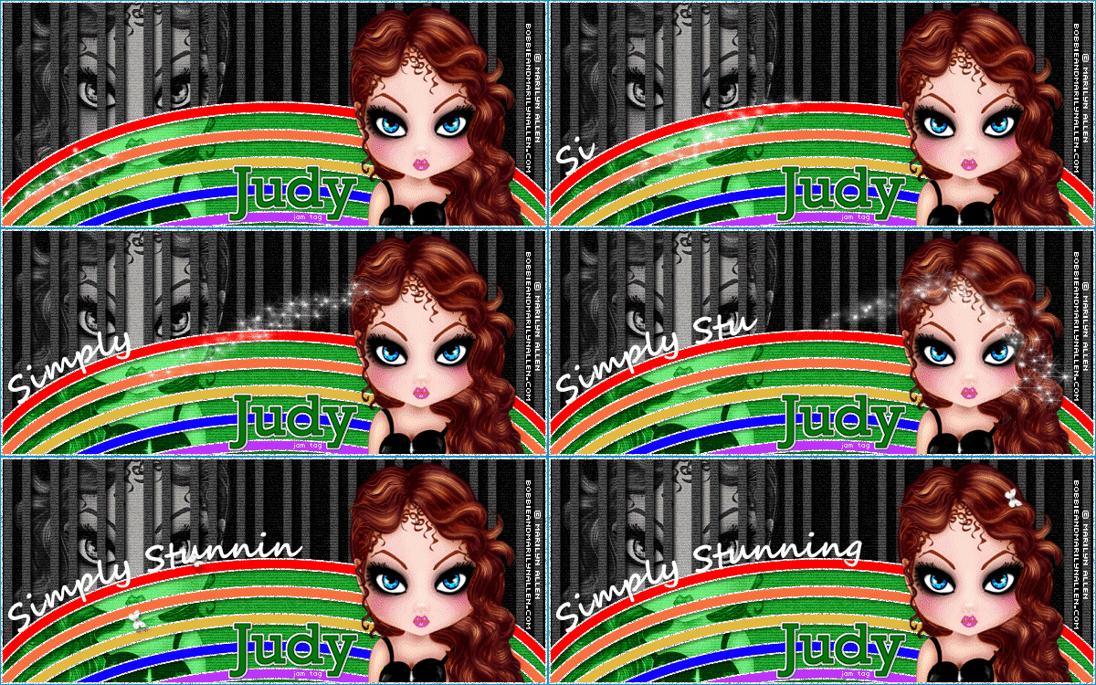
This was a fun tut and I plan to do another version.
The font I used for my name is Rockwell size 48. I used the script font Segoe Script for the animated message and Pixelette for the credits.
I changed the wording for the animated text and had to adjust the animation on my tag accordingly.
Show us your results!! |
|
|
|
|
 أول
أول
 سابق
2 إلى 9 من 9
لاحق
 آخر
آخر

|
|
|
|
من: timber |
مبعوث: 27/02/2018 06:29 |
Oh, cool... a new tutorial challenge!  Thanks for posting this, Judy!  I've been spending the last few days doing "admin stuff", so it will be a nice break  to do a tutorial challenge. Love your results and thanks for sharing your tag details!  |
|
|
|
|
|
من: justjam |
مبعوث: 27/02/2018 17:13 |
U R Welcome timber. I know you've been busy with other things, but I found this tut and had to try it out. I wanted to share it here because I think it would make a good St Patty's Day tag. Although I don't have many tubes or elements to use for St Patty's Day, I found a few and tried this tut again....a much simpler....fewer layers version!  |
|
|
|
|
|
من: timber |
مبعوث: 27/02/2018 19:37 |
You're right, Judy. This tutorial fits nicely as a St. Patty's Day tutorial. I like your second tag even more, and I think I will follow your lead and make my tag a St. Patty's tag when I do this tut. I love the graphics you chose!   |
|
|
|
|
|
من: timber |
مبعوث: 02/03/2018 08:34 |
Judy, can you tell me which of the tutorial steps adds the scanlines to the tube and background color? I see them on your tags and the tutorial sample, but I don't see the step where they are added there. I see a step that adds them to the Lines layer only. And I don't understand how adding the scanlines to this layer has any effect as the lines are black. I must be missing something  . |
|
|
|
|
|
من: justjam |
مبعوث: 02/03/2018 15:08 |
LOL timber, you are so right! I thought the same thing. I could not find the instructions for the scanlines to the items you mentioned. I decided there was a mistake in the instructions and I liked the sample in the tut, so I added them myself. You are not missing a thing. I thought it was just me that missed something!  |
|
|
|
|
|
من: timber |
مبعوث: 03/03/2018 05:34 |
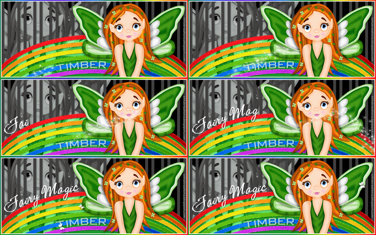
Wow, I don't know why this tutorial was so challenging for me, but it was. I kept making mistakes today and then I got stuck on how I wanted to make my name. I found it difficult to pick a tube to use also, but I was able to find this image from a Kittz Kreationz scrap kit, St. Paddy's Day. Naturally I went my way on this one. 
I followed the tutorial at first, but after filling the bows with her colors, I thought the red and orange bows looked too much alike, and somehow the rainbow didn't look right to me. So in addition to using different colors, I added another bow. So what I did was duplicate the Grey Oval Line and then Offset it (effects/image effects/offset) using settings H:0 V:-22. Then I duplicated this layer and repeated the offset. I continued to duplicate and offset until I had six bows.
For the bow fill, I picked colors from a rainbow animation that I have and instead of filling each bow with a solid color I used the foreground-background gradient using a dark color and a light color (style=sunburst, H:30, V:30).
For the bow glitter outline, I filled each bow separately using a light color instead of using white. I guess I can't do anything the easy way LOL. The white looked okay, but I wanted to see how it would look with colored glitter edges and after seeing it, I liked it more. I discovered something I didn't expect when I added the noise; the noise shows nicely on the light colors and okay with blue and purple, but you can hardly notice noise added to the red outline. I even tried adding noise with DSB Flux Bright Noise and the result was the same. I looked at both monochrome and colored noise, but the red bow just didn't want to show the noise very well.
For step #5, I applied the PhotoEffex Scanlines filter to the Lines layer, but it had no effect on my left-side tube or my background layer, so I applied the filter to both of those layers.
For step #12, I didn't duplicate my tube. After applying the blur and changing the blend mode to Soft Light, my tube looked exactly the same except lighter and I felt it wasn't needed.
For the frame, I added a new layer, selected all and filled with a rainbow gradient using the same sunburst settings that I used for the bows, filled it again with the blend mode of the Fill Tool set to Multiply (to darken the gradient), contracted by 3, filled with white, contracted by 2, then deleted the selection and selected none.
The tutorial mentions the font CAC Shishoni Brush, but "Magically Delicious" is actually Bickley Script LET Plain font. I used CAC Shishoni Brush on my tag for "Fairy Magic". For my name, I used Bank Gothic BT and placed my name on a curve. I used color #A0A0A0 and set the blend mode to Screen.
I learned a new way of placing text on a curve! I like this new method of placing text on a curve as it's way easier to make adjustments to the placement of the text along the curve than the way that I was doing it before. The tutorial uses the method of placing text on a curve that I learned long ago. I found the instructions for this new method in my PSP Help menu; it's called Fit Text to Path. I will be writing up a tutorial with some screenshots to demonstrate how to use this method.
I slowed the frames of my animation down to 15fps and saved my tag using Median Cut and Error Diffusion settings.
|
|
|
|
|
|
من: justjam |
مبعوث: 03/03/2018 14:54 |
Oh timber, your tag is so cute!  Your tube is darling. I just love the way you did your rainbow. It looks so much better and I like the idea of doing a colored glitter for the edges. It sounds complicated, though. I had trouble with the scanlines on my background images also, but found a way to apply the filter to them anyway. Thanks for the tip on placing text on a curve. I am all about making things easier!  I'll take a look at my psp help menu and try it out. I'll look forward to your your tut on this! |
|
|
|
|
|
من: timber |
مبعوث: 03/03/2018 20:01 |
Thank you, Judy!  Coloring the edges is no different than filling the edges with white except you fill with a color instead of white. The complicated part was probably using a gradient for the fill. If you wanted to have a colored edge, you could fill with the same color as the bow or use a lighter color which is what I did. Of course you would still need to have the edge fill on a separate layer from the bow so that you can add noise to it.  |
|
|
 أول
أول
 سابق
2 a 9 de 9
لاحق
 آخر
آخر

|

