|
|
| De: timber (message original) |
Envoyé: 12/08/2018 02:12 |

Click the header to go to the tutorial.
If you have any questions about this tutorial, please ask them on this thread.
And don't forget to show off your results when finished!  |
|
|
|
|
|
|
De: timber |
Envoyé: 12/08/2018 22:13 |
Thank you for giving this tutorial a test for me and for your feedback, Karla!  Okay, so I was confused right from the beginning. Had to reread it to finally get it (that is on my part lol). When it came to selections thing with palette on as new layer, that had me with a big ? lol I did the selections numbers and it just selected a white long strip of the "white" part of the canvas.
After you paste the palette onto the canvas, you create a custom selection on the palette layer, so when you edit>copy you're copying the selected portion of the palette to the clipboard.
This no-script version is basically a carry-over from my script version. In the script version the palette is pasted onto the working canvas and the script is run. When I created the no-script version, I was lazy and just copied most of the instructions from the script version. Normally I would probably keep the palette as a separate image from the canvas and write it that way. I guess I was trying to kill two birds with one stone. Looks like you got stoned  LMAO. Whoops! LMAO. Whoops! 
If you only copied white after creating your custom selection, they you must not have been on the palette layer. It sounds like you were on the Background layer.
When I got to step 9, I was looking for create "Selection From Vector" but there is only "Selection From Vector Object". So I figured that is what is meant and did that.
Here once again I am assuming that most people work with vector text  and know how to create selections. I will add the menu path for this part, thank you for mentioning that and know how to create selections. I will add the menu path for this part, thank you for mentioning that  . .
In step 12, my text vector layer is at top (all others are below it as raster). So I thought it did not look right with the thick white border "text" and no effects showing. I realized that I may have done some layering process wrong and moved my top (text vector w/ white 4.5 stroke) to the bottom - hiding the background of white.
This feedback is so helpful to me. These "pro" tutorials of mine are basically my own notes, and I know very well what I'm doing but I forget that others do not. If I am going to write for others then I will need to make some additions to the notes so others will understand.
In my older, more detailed tutorials I would show screenshots of the canvas and of the layer palette. I would also say which layer to make active before the next command is performed. In these "pro" tutorials I only state the layer at the beginning of the step. So at step#10, I state "text layer" which means to make the text layer the active layer. If the text layer is the active layer, then you would be adding the "ice" and "outline" layers above the text layer in the Layers palette, not below.
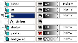
At step#12, I state "text layer" again which means to make the text layer the active layer. Then you are to edit the vector text and add the stroke=4.5. If your text layer is below your ice and outline layers, then it would have looked like the tutorial results. Here's a screenshot of the Layers palette through editing the text to add the stroke value.

Other than having the white stroke layer, your results look right on. Your seafoam tag is pretty, and I understand what you mean by it looking like it's on the light side. I had similar results when I used the Buttermilk Font.
I have never tried some of the process explained in this challenge...
Your fresh perspective on doing these never-tried processes is a help to me moving forward and learning what instructions to add to my "note tutorials", so thank you for the great feedback!
I see that you chose to use Optimized Octree and Error Diffusion. Can you share why you chose those settings as opposed to what I chose? When I save a tag I usually try all the combos of settings for the Colors tab to see which one looks best. With the Error Diffusion setting, I could see pixellation in the drop shadow. But that visible pixellation could only be seen when I zoomed in like 600% LOL. I suppose if I just look at the optimized tag at 100% I wouldn't notice it  , as I don't notice it on your tag. I have seen you mention many times that you "color enhance" your tags. I would like to learn more about that as to what you do and why. Can you explain? Aww... another dolly tag  . That's a Sayclub doll, and they are some of my faves! Everytime I see one of your doll tags, I think I need to create a doll tag, but I can't seem to get my head out of text  LOL. What I have noticed about the Coconutice preset is that it darkens what you glass. So what I frequently do to compensate for the darkening is to duplicate the glass layer and then set the blend mode to hard light. That usually brightens it up nicely. Thanks for playing and trying new things and showing your results, love it!   |
|
|
|
|
|
De: SilentEyez |
Envoyé: 13/08/2018 03:38 |
Glad my input is helping you out too! Your notes and tutorials are always helpful and I am learning so much with each one I try out (yours and Judys tuts). As long as you ladies share tuts and notes, I will keep on PSPing to learn new tips and tricks with you all :-D
Before I forget, I had my text layer at top because when I moved drop shadow layer down, I kept that layer "active" and proceeded with the tutorial from there. So every layer added was placed above DS layer. That explains why my text vector layer remained at top :-D
I like to enhance the colors of my work to get it more colorful. Sometimes, effects and gradient may not look okay, in regard to color. For example, colors might be dull or not as noticeable. So what I try to do is make it POP (lol, I seem to use that a lot) ;-) In the tag above, when I finished the steps, it looked okay but I wanted more. When I enhanced it once, it got brighter - enhanced it more and BAM! Brighter red lol
Example (the one on right does not have same Sparkles placing, since I was testing stuff out but text is same):
Same with the dollies I assemble in dollmakers and edit myself:
Even when I do only text work, I use the same settings w/ skintones present. Usually, it makes it brighter, if not then I uncheck it. I repeat the enhancement depending on how colorful I want it to be :-)
As for the Error Diffusion, I think when I first tried this tut and saved mine, the colors were a little weird on mine, so I tried a different save setting and it looked okay to me. |
|
|
|
|
|
De: SilentEyez |
Envoyé: 13/08/2018 11:12 |
I want to share another try I did at this tutorial. I used the font PlainBlack Normal @ 92 pt. For the color in mine, I used one of my Halloween (byKarlaSE_SpecialHalloween01.png) backgrounds, which I know Timber knows about :-) I selected a section and applied a radius 6.00 gaussian blur. The doll I used is h06 (name file).
|
|
|
|
|
|
De: timber |
Envoyé: 14/08/2018 01:05 |
Okay, I see what you did, Karla, thanks  for feedback. It seems that I should mention to activate a layer before performing the next step. Thanks for sharing how you enhance the color in your graphics  . I rarely ever use the Automatic Saturation Enhancement, but it's nice to have it mentioned so I can keep it in mind to play with. I love  your animated screenshots, so I added one to this tutorial  . I don't know if you noticed, but that was thanks to you  . Oh, how interesting to add the Fade To Grey effect to a doll. Thanks for playing around and trying new things  to show us. I love the colors in the background that you used on your text.
So since you mentioned your Special Halloween backgrounds, I created a palette from the byKarlaSE_SpecialHalloween03 background using the four colors in equal amounts except for the darkest color; I used "half size" for the darkest color. I used this palette and the font, Blazed. Judy mentioned Halloween fonts so I looked through my folder of Halloween fonts and found the Blazed Font. I thought it would be perfect with the palette, so I created this tag.  |
|
|
|
|
|
De: justjam |
Envoyé: 14/08/2018 02:57 |
Wow, cool tags Karla and timber! I love the fact that you included the doll in the fade effect.  It looks so cool.
Timber, I love that blaze font. Now I have to play with that one too. 
I played again and used a font called transylvania and used the blend mode of burn on the outline layer. The color palette I used was called trick or treat by punksafetypin.
This is another addictive tut. Thanks timber. 
|
|
|
|
Réponse |
Message 12 de 21 de ce thème |
|
|
De: timber |
Envoyé: 14/08/2018 03:16 |
Wow, you find some interesting fonts, Judy  . I love your latest tag and the colors. If you think the tut is addictive now, wait until I share the script and you can make tags in a flash!   |
|
|
|
Réponse |
Message 13 de 21 de ce thème |
|
|
De: justjam |
Envoyé: 15/08/2018 06:24 |
Woo Hoo, I tried your new scripts timber.
I used the Mockingbird font and the pungent color palette. I can't wait til tomorrow to play
around with the script! Thanks for sharing this. Awesome. 
|
|
|
|
|
|
De: timber |
Envoyé: 15/08/2018 07:52 |
Omigoodness  , you mean I didn't break something for a change?!  That's great to hear that you got the script to work, Judy!  Did you run into any problems, or do you have any questions about any of the instructions? I tried real hard to explain things clearly but it seems there's so many adjustment possibilities that it's hard to explain them all and still try to keep things simple. Maybe my brain doesn't think "simple" LOL. I think you will get an understanding of what the script is doing as you use it and make adjustments to the custom selection settings and vertical offset settings. The script version is more complicated than the no-script version, but it's nice to have the options that the script provides, and the script makes the tag making so much faster. And if you're not happy with the outcome, you can just click the undo button and do it again. Please give me some feedback so that I know if I need to make any clarifications or make changes to the instructions. Whoo-hoo for you!   |
|
|
|
Réponse |
Message 15 de 21 de ce thème |
|
 Oh my, those are some fabulous tags, ladies! I do not think I have ever seen that Transylvania font before. Looks cool with the colors chosen! Oh my, those are some fabulous tags, ladies! I do not think I have ever seen that Transylvania font before. Looks cool with the colors chosen!
When I thought of trying out a Halloween bg, I realized that the other bgs I have (the stripes and stuff like that) can be used too! Lotsa different color combos.
I also think this was an addicting tut - well, let me just say that all of them are lol I love trying them out as much as I can with other fonts/colors and adding dollies when it tickles my fancy lol I have always loved using dollies.
|
|
|
|
|
|
De: justjam |
Envoyé: 15/08/2018 22:32 |
I got to play for a bit this afternoon and I tried out the font Blazed that timber used.
I used the evil jack palette and wanted to put the light yellow color on the left of the finished color swatch rather than the top. I rotated the palette to the left 180 and changed the selection to:
top 130, left 105, right 490 and bottom 190.
Here are my results.
|
|
|
|
Réponse |
Message 17 de 21 de ce thème |
|
| Ooh, that came out awesome! Colors are fab ;-)
|
|
|
|
|
|
De: timber |
Envoyé: 16/08/2018 00:51 |
 Oh, I like the palette you chose, Judy! Those are great colors to use for this font. And that's awesome that you tried something new by turning the palette horizontal  . I think it's great to do something just a little different each time when making one of these tags to show the numerous possibilities.
I'll post your palette here for anyone who may be interested. Those colors are very similar to the palette that I used. Did you also use the yellow color? Isn't that 'J' gorgeous in this font?  I love  it.
For my Love it! snag above I used the Disco Love palette. For this one I tried something different. Instead of using an AS image effect, I went "old school" and created the animation frame by lowering the opacity of the layers in PSP. I still copied the middle frames and reversed them for the sunrise-n-set effect. My choice to make my tag this way came about because this palette created such dark text, so I duplicated the text layer and tried different blend modes to lighten the text before settling on Dodge. As I moved the opacity slider back and forth to find a setting that I liked I realized I was creating the sunrise-n-set effect. I created a "drop shadow" by duplicating the text layer, moving it down the palette, blurred it by 1.0, then lowered the opacity. I duplicated this "drop shadow" layer and set the blend mode of the duplicate layer to Dodge. When changing the opacity of the text Dodge layer, I also changed the Dodge layer of the "drop shadow" just to try something different. I set the display time of the frames differently as well. |
|
|
|
Réponse |
Message 19 de 21 de ce thème |
|
|
De: justjam |
Envoyé: 16/08/2018 01:25 |
Thanks, Karla and timber . I just noticed the palette I used is similar to the one you used. Yes, I used the yellow, but I don't think I got a lot of it in the final image.
I love the J in the Blazed font! 
Cool way to make a similar tag by lowering the opacity. Thanks for sharing your settings. I'll have to play with that myself. 
I am going to play with brighter colors. All of the ones I've tries so far have been on the dark side.
|
|
|
|
Réponse |
Message 20 de 21 de ce thème |
|
|
De: timber |
Envoyé: 09/08/2021 22:32 |
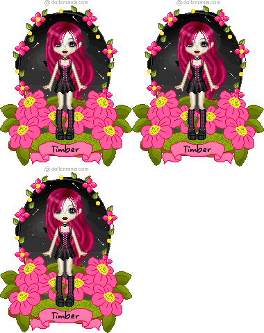
I was aghast  when I viewed this tag when I got my new bright monitor  . I couldn't believe how dull and faded it looked  .  I've been wanting to remake the tag so it looks like it did when I designed it, so now it's much brighter and more along the lines of what I intended. I wasn't paying full attention to my notes, so this tag has a wider white border.  |
|
|
|
Réponse |
Message 21 de 21 de ce thème |
|
| Wow, that is a big difference! Looks great, Timber!! Also love your Disco Love one!! ;)
|
|
|
 Premier Premier
 Précédent
7 a 21 de 21
Suivant Précédent
7 a 21 de 21
Suivant
 Dernier

|

