Those both look great, Jossie! You have to tell me which gradients you used

.
Sometimes I don't like writing tutorials because I think that my instructions will confuse people lol. I'll try to explain my thought process.
I like the
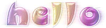
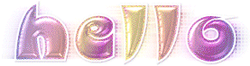
look of the text with stroke=2 but I wanted a subtler glitter effect than stroke=2. That is why I added the extra layer above the text layer and changed the stroke to 1.5. Even though there is a stroke=2 text layer below the outline, only the width of the outline will be animated. I've created examples to show you the difference.


As you can see, the stroke width looks the same for each example, but the glitter effect is different based on the stroke width of the outline layer.
In your brown "awesome" tag, it looks like you missed a step in regards to the wind but the animation looks right on. In your "thanks" example, the wind looks right. As with all tutorials that you do, you can make changes here and there to suit your own likes and dislikes.
 Post Codes
 PSP Challenges
 Smileys


 .
.