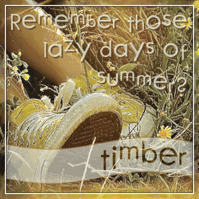
For this particular photo, I've changed a few of the tutorial steps. I've omitted step #7 (the colorize step) and instead of changing the top layer to Burn, I've left it as Normal and just reduced the opacity of the layer to 50.
To create the wavy strip where I've added my text, I selected a rectangle the width of the tag and filled it with a medium brown color from the image. Contract the selection by 2 pixels and delete the selection. Then I picked another color from the image (a light color) and I filled the selection, but this time I changed the opacity on the Flood Fill tool to an amount between 30-50 (whichever looked good). Then I applied Effects>Distortion Effects>Wave (horizontal: 0, 100; vertical: 3, 100; transparent checked).
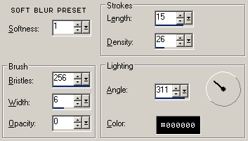
For the frame, I took the original background layer, duplicated it and sent it to the top of the Layer palette. Select all then apply Effects>Art Media Effects>Brush Strokes: Soft Blur Preset. The Soft Blur Preset came loaded with my PSP8, but if you don't have it, then you can create a preset for yourself with these settings.
Contract the selection by 10 and then fill the selection with white. Contract the selection by 2 and then delete the selection. Then fill the selection with a very dark color from the image (set the opacity on the Flood Fill tool to 50). Contract the selection by 2 and delete the selection.
The font that I've used for the words and name is
2Peas Favorite Things.
The words are two layers of text (one light layer on top and another layer underneath using a darker color). I've offset the dark layer of text to create a drop shadow effect. You may ask why didn't I just add a drop shadow. I like to use a second colored layer as my drop shadow because it allows me more flexibility to change the opacity of the layer (and to add a blur to it if I should like to do that). For both of these text layers I have reduced the opacity to make the words a bit see-through.
For the see-through effect on my name, I create my text in vector format and placed it on the wavy ribbon where I liked it. For this font I had to adjust the size of some of the letters because they were two thin and small. After adjusting the text, I created a selection from vector object. Then I made the original background layer active and promoted the selection to a layer. Move this layer above the vector text layer, then delete the vector text layer (you don't need it anymore). Add a drop shadow to the promoted layer (1, 1, 2, 25, color=very dark color from image).
Then for the sparkle, I've added Xenofex 2.0 Constellation (2, 15, 15, 0, 100, 75, 45, keep original image checked) to the original background layer. I did that three times (change the random seed for each frame of animation).
 Post Codes
 PSP Challenges
 Smileys