|
|
| De: justjam (Missatge original) |
Enviat: 24/10/2018 19:38 |
Rust and Scratches 
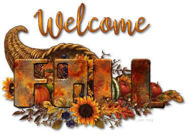
I have had this tut marked to try for a long time and finally had time to give it a play. The header is free to snag if you'd like.
I used the font Zyborgs for the word "Fall". It is a free font that you can get HERE
The other font is called Austin but, it is not a free font.
I followed the instructions and started the tut by opening a new image with a white background and creating my text as floating.
Usually, I used a transparent canvas and vector text. I found out that I could not get the Mosaic Glass Texture Effect to work if I did it this way.
So after applying this effect, I promoted the selection to a layer and deselected it.
I think this technique will look really good for a steampunk tag!
I hope you'll give this a try and return here to show off your results.
|
|
|
 Primer
 Anterior
2 a 5 de 5
Següent
 Darrer

|
|
|
|
De: timber |
Enviat: 24/10/2018 23:54 |
Great results, Judy! Thanks  for posting this challenge. I've always enjoyed doing Pinoy Tutorials because they're so easy. I've been playing around with this technique, trying different fonts, some of them steampunk fonts, but I wasn't pleased with any of them. This technique looks best on thick fonts as you can see the texture the best. I'm working with a blue color and I'm liking the coloring, but I need to find a font that I like to display it in, and then I wanted to animated it with noise  LOL. Hmm  ... maybe I'll glass it  . Wouldn't that be different?  What I discovered about this technique is that you have to have floating text when you apply the Mosaic Glass or you won't have access to the Locked Transparency Fill Color setting. After applying the Mosaic Glass you can defloat your text and apply all the other settings to selected text. I didn't deselect my text until the end, and I think my results are correct. I suppose I could follow the tutorial as written and see if it makes a difference. I'll be back later with results after I find a good font to use. |
|
|
|
|
|
De: justjam |
Enviat: 25/10/2018 01:05 |
I can't wait to see your results timber! I know you will come up with something awesome! 
I realized that you needed floating text also. That is what I was trying to warn about when I said the Mosaic Glass Texture wouldn't work with my vector text. LOL Maybe I should have been more specific and saved you some time. 
I am still playing with this tut and want to try other colors and will check back in with you later. |
|
|
|
|
|
De: timber |
Enviat: 25/10/2018 07:00 |
I'm ready to post some results but I'm definitely not done playing with this. I used a blue base for this tag but I'd like to play with other colors, of course  . I wasn't sure if I would be able to "glass and glitz" a rusty tag, but I found a way!   While testing some settings for short names, I made a pressie for you, Judy, uploaded here.
Here's the settings for how I made my tag.
- I used Gunslinger Spur Font.
- For the text fill, I chose two blue colors for my gradient, #0B3D91 and #00A0C6, and set the gradient angle to 240. I converted the text to curves as character shapes so the gradient would be applied to each letter (instead of spanning all the letters).
- For the text stroke, I have two layers. The lower layer of the two is a grey color #A4A4A4 with stroke=2. The upper layer is a green color #51B0A0 with stroke=1 and the blend mode is set to multiply. I have been using this technique of having two stroke layers with the top layer set to multiply for some time and I like the results.
- All of my settings for the tutorial steps are the same except I changed the Locked Transparency Fill Color of the Mosaic Glass filter to #808080 (instead of using black).
- After going through all the steps I duplicated the text layer and then applied SBP Coconutice (shape=3, radius=32). I set the blend mode of this layer to hard light.
- I added noise to the lower text layer (gaussian, 35, mono).
- I added a drop shadow (3, 3, 25, 3, black).
Thanks for posting this tutorial, Judy, I enjoyed doing it!  |
|
|
|
|
|
De: justjam |
Enviat: 25/10/2018 21:05 |
|
I love  your results, timber. The colors are gorgeous! I really like the turquoise and rust combo. It looks great animated.
Also, thanks for sharing your method for making this tag. I'll have to try out some of these new options. 
Thanks for making a pressie for me. I love it  . I hope to play with this tut some more this afternoon.
|
|
|
 Primer
 Anterior
2 a 5 de 5
Següent
 Darrer

|

