
You may print this out for your own personal use, but please do not rewrite, translate, e-mail out, offer any part of this on any other site, add to a CD, or claim this as your own. Your finished result is yours to do with as you please, including making tags and/or snags for others. You may offer your results wherever you wish, but you may not sell for profit. This tutorial was written by timber on August 26, 2009.
I wrote this tutorial using PSP8 and Animation Shop 3.10. For this tutorial, I am going to deviate from my normal style of tutorial writing which includes lots of screenshots and details (if a screenshot or more details are needed for any particular step, then please let me know, and I will edit the tutorial to add them). To complete this tutorial you should have a comfortable working knowledge of the Tools, Materials and Layer palettes, as well as the Menu options and working with plugin filters. Unless I say otherwise, all 'clicks' are with the left mouse button.
For this tutorial, you will need:
Paint Shop Pro
Animation Shop
SuperBladePro
SuperBladePro Presets from AnotherJo's Silver Heart Frame Tutorial Supplies
Ivy's Graphics Fantasy Gradient or another multi-colored gradient of your choice*
Richard Rosenman Halftone Filter
Slugfest Font
DSB Flux Bright Noise (optional)
*Notes: At the end of this tutorial I have several other gradient examples. I have provided links to the pages where some of the gradients can be downloaded but I couldn't find some, so I have uploaded the remaining gradients to a folder here which includes a few gradients that I made myself. |
1. Extract the ivy_fantasy.jgd file to your Gradients folder.
Extract all the files from the silver_heart_sbp zip folder to the Environments and Textures folder of your SuperBladePro folder.
Extract the halftone.8bf file to your PlugIns folder.
Open PSP and Animation Shop (AS).
Open the font and minimize it to the taskbar. |
| 2. Create a new image 600x200 with a white background. If you are making a tag with two lines of text, then increase the height to 300. |
| Create the Text |
| 3. Add a new vector layer and name it "Text" (Layers>New Vector Layer). |
4. Load the Text Tool and apply these settings (for PSP 10/11/12 use size 120). If you prefer smaller letters, then you can choose a size between 72-90 (I've used size 80 for the tutorial header above, but I will be using size 90 for my example screenshots).
 |
5. On the Materials palette, set the foreground material to gradient with these settings.
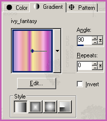
Set the background material to gradient with these settings.
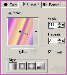
 |
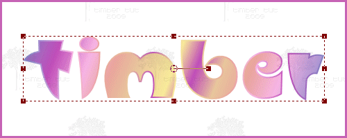
6. Click on the canvas, type your text into the Text Entry dialog, and then click Apply. Center the text on the canvas (Objects>Align>Center in Canvas).
 |
7. Duplicate the Text layer (Layers>Duplicate). Rename the layer "Outline". This is the layer that we will be adding noise to for the glitter effect. Edit* the layer by setting the background material to transparent (null). While still in edit mode, change the stroke value for the glitter effect that you'd like for your tag (for a thick glitter effect, leave the stroke at 2; for a very subtle effect, change the stroke to 1; I will be changing mine to 1.5).
*Since this is an advanced tutorial, I will assume that you already know how to edit vector layers, but if you need detailed instructions and screenshots, then you can refer to my Three Times a Gradient Text Tutorial step #19.
  |
| 8. Duplicate the Outline layer. Rename this layer "White". Edit the layer by setting the foreground and background materials to white (#FFFFFF) and the stroke to 8. Send the layer to the bottom of the Layer palette (Layers>Arrange>Send to Bottom). Note: Normally when I have a white "halo" layer below text I will create a selection from the text, expand the selection, and then fill with white. But this particular font has points on it and those points are rounded when the selection is expanded. |
| 9. Select the White layer (Selections>From Vector Object) and convert it to a raster layer (Layers>Convert to Raster Layer). |
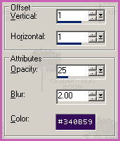
10. Add a drop shadow (Effects>3D Effects>Drop Shadow) with these settings (Color=#340B59).
 |
| 11. Make the Text layer active. Select it (Selections>From Vector Object) and convert it to a raster layer (Layers>Convert to Raster Layer). Note: You don't need to deselect from the previous step in order to create a selection of this layer. |
| 12. Contract the selection by 2 pixels (Selections>Modify>Contract). |
| 13. Apply the SuperBladePro Silver Text preset (Effects>Plugins>Flaming Pear>SuperBladePro). Click the Open Settings button and choose silver_text-jh.q5q from the list of presets. Click Open. Click OK. |
14. Deselect (Selections>Select None).
 |
| Create the Windy Halftone Background |
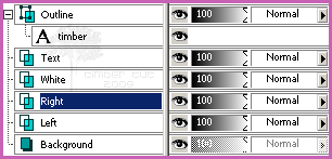
| 15. Duplicate the Text layer and send it to the bottom of the Layer palette. Rename the layer "Left". |
16. Duplicate the Left layer and rename it "Right".
 |
17. Apply wind (Effects>Distortion Effects>Wind) with these settings.
 |
| 18. Make the Left layer active and apply wind again, but change the wind direction to "From left". |
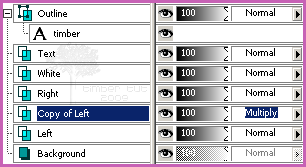
| 19. Duplicate the Left layer. |
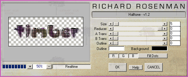
20. Apply the halftone filter (Effects>Plugins>Richard Rosenman>Halftone) with these settings.
 |
21. Change the blend mode of the Copy of Left layer to multiply.

 |
22. Load the Magic Wand Tool and reset it to default. Click the black grid to select it. Delete (Edit>Clear) the selection and deselect (Selections>Select None).
 |
| 23. Optional: For a darker, more dramatic halftone effect, duplicate the Copy of Left layer and then adjust the opacity slider to your liking. I do this for some of the lighter gradients. |
| Crop The Text |
| 24. Hide the Background layer. |
| 25. Load the Crop Tool and snap crop rectangle to merged opaque. Crop. |
| 26. Unhide the Background layer. Note: If you choose the leave the Background layer hidden and make your tag with a transparent background, then the windy halftone background will not be as dark. To fix this, just duplicate the Copy of Left (Multiply) layer. |
| Animate The Text |
| 27. Make the Outline layer active and convert it to a raster layer. |
28. Add Noise (Adjust>Add/Remove Noise>Add Noise). For my tag, I with be using the settings below, but you can use whatever type (colored or monochrome) and amount that is pleasing to you.

Note: I am using colored noise for this tag because of the gradient that I chose, but for other gradients I may use monochrome noise. If you're using PSP7 and you don't have monochrome noise, then you can use DSB Flux Bright Noise (Direction=Mix). If you're using a dark gradient, you may need to increase the amount of noise quite a bit for it to show on the outline. |
| 29. Copy the merged image (Edit>Copy Merged) and then paste into Animation Shop as a new animation (Edit>Paste>As New Animation). |
30. Go back to PSP and undo the noise setting (Edit>Undo Add Noise).
Re-add the noise setting. |
| 31. Copy the the merged image (Edit>Copy Merged) and then paste into Animation Shop after the current frame (Edit>Paste>After Current Frame). |
32. Repeat steps 30 and 31.
You should have three frames of text in Animation Shop now. |
| Save the Animation |
33. Save the animation (File>Save As).
Click the Customize button.
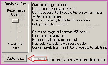
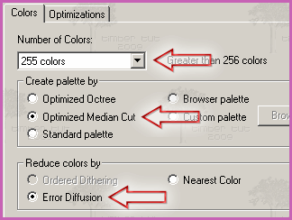
Click the Colors tab and choose these settings.
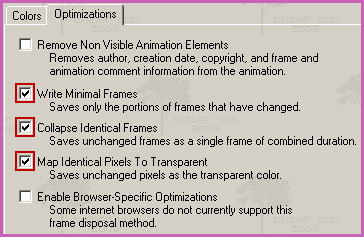
Click the Optimizations tab and choose these settings.
Click OK.
Click Next.
Click Next.
Click Next.
Click Finish.
YOU'RE DONE!!!
 |
| More Gradient Examples |
I have created a number of gradient examples for you to play with but please experiment with other gradients as well. I have chosen mostly light-colored gradients for my examples because the noise shows better on the lighter colors, but you can also use darker gradients.
ESP Concepts Easter_Pastels

Yvonne's Fruit Trifle

These examples below were made with gradients from Barry's Place which I am unable to locate online, so I have included these gradients in the tutorial supplies. You can view his Gradient page through the Wayback Machine here.
Barry's Place A_37

Barry's Place E_13

Barry's Place H_36

These examples below were made with gradients from Ingerlise's PSP which I am unable to locate online, so I have included these gradients in the tutorial supplies. You can view her Gradient page through the Wayback Machine here.
ib11

ib15

ib35

ib_jul01

ib_jul05

ib_jul21

This example below is made with a gradient called Fall Leaves but I can't remember where I got it. If anyone knows where this gradient can be downloaded, please let me know. I've included this gradient in the tutorial supplies.

These examples below were made with gradients that I created, and I've included them in the tutorial supplies. These are PSP8 gradients, so they may not be compatible with PSP7. If this is the case and you'd like the gradient settings, then please let me know.
Autumn01

Purple Ink

Rainbow01

Skittles
 |
I'd love to see your results!
You can post them with the other member results
HERE |

