|
|
| Da: timber (Messaggio originale) |
Inviato: 05/02/2018 00:17 |
Tumbling Hearts Tag
This "forum style" tutorial was quite easy to do. The only plugin filter used is MuRa's Meister Copies.

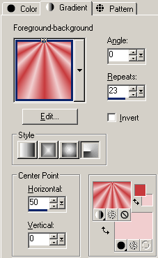
For my tag, I used the #2 brush. Instead of using a solid color, I used a red-pink gradient (I liked the variation of color). This is the gradient setting that I used for my brush impression (I've included the colors that I used in the lower right; that's my Materials palette). I discovered that the gradient pattern is different depending on the coordinates of your mouse when you make the impression. I made my brush impression in the very center of the canvas.

I added a second brush layer below that (I still used the #2 brush), but I lowered the opacity to 10.
For my text, I used the same red color but I applied the silver-text SuperBladePro preset from the Silver Heart Frame Tutorial by Another Jo. My text wasn't standing out enough, so I duplicated the text, moved it down below the text layer, gave it a gaussian blur of 5, then changed the blend mode to overlay. That seemed to brighten it a bit. But I still wanted something more, so I duplicated the text layer again, moved it down, then applied Eye Candy 4000 Motion Trail. The motion trail grabbed the white outline thus making the text stand out more against the background.
The font that I used is called 5AM Melfina. It's a neat serif font with hearts on some of the letters (unfortunately I didn't have any of those letters lol).
I added a 10-frame heart twink animation in Animation Shop, but for every heart I changed the twink sequence so that it looks like a sort of wave pattern (or a heart beat).
Have fun with this one; I can't wait to see your results.
|
|
|
|
 Primo
Primo
 Precedente
2 a 4 di 4
Successivo
 Ultimo

|
|
|
|
Da: justjam |
Inviato: 05/02/2018 01:55 |
Oh boy, another tut to play with.  I did this one a long time ago but, I need to try it again since I have been away from PSP for so long. Your tag is gorgeous and I really like the font you used for your name. I love brushes and will be back with me new results. Thanks for posting this! |
|
|
|
|
|
Da: justjam |
Inviato: 05/02/2018 06:13 |
I made a couple of tags from this tut this evening. The first one I pretty much followed the tut.  On the second one, I used brush #2 and did not use the text line provided. Instead, I used my name and Mura Copies with the line setting of 5. I duplicated that line and added it to the bottom. The font I used for my name is Bradley Hand. For a drop shadow on the name and the heart brush lines, I used #800000.  This is a fun and easy tut. Thanks for posting it, timber. |
|
|
|
|
|
Da: timber |
Inviato: 05/02/2018 07:21 |
Now you're getting your groove back, Judy!   Your results turned out great; the red is so dramatic! I love the dimensional appearance of the hearts on your second tag; they appear to pop right off the page. I loved  reading all your tag notes; thanks for including those!  My tag posted above was made years ago, so I may give this tutorial another play and maybe use a different color and font.  |
|
|
 Primo
Primo
 Precedente
2 a 4 de 4
Successivo
 Ultimo

|

